Ending Pandemic Unemployment Benefits Early: What Public Card Data Can and Can't See
In June and July 2021, 26 states announced they would stop paying federal pandemic unemployment benefits two to three months before they expired nationally, and 24 carried it through. Kyle Coombs, Arindrajit Dube and four coauthors followed 18,648 benefit recipients, in cutting and retaining states, through their bank accounts and found a large, fast drop in spending where benefits ended. This post asks a narrower question: can anyone see that drop in the public card data that analysts, journalists and policy teams work with every week?
The answer turns out to depend on a choice that is easy to make without noticing, which states you compare against. Working out why, and what the data could have shown under either choice, is the useful part.
What the bank data showed
The states announced the cuts in May 2021 and carried them out between June 12 and July 31. Coombs and coauthors used the fact that some states cut and others did not to measure the effect on people who were receiving benefits at the end of April (August 2021 working paper). Their difference-in-differences estimates, through early August:
- unemployment benefits fell by $278 a week;
- employment rose by 4.4 percentage points;
- earnings rose by $14 a week, replacing about 5 percent of the lost benefits;
- spending fell by $145 a week, about 20 percent.
Scaling the spending estimate to every recipient in the withdrawal states, they put the total loss at about $2 billion over the summer. That figure is an extrapolation, and the authors say so. The version published in the AEA Papers and Proceedings in 2022 covers employment and earnings only, with a slightly different sample of 16,253 workers; the spending numbers above come from the working paper.
Their data are not public, so this is not a replication. It is a test of whether the effects they measured are visible at the level of states and counties.
Data and design
Data. The Opportunity Insights Economic Tracker publishes daily card spending from Affinity Solutions by state and county, seasonally adjusted and indexed to January 2020 as a seven-day moving average, plus weekly continued unemployment claims from the Department of Labor. I take the Saturday value of each week, which I read as that week’s average (the tracker does not state whether its window is trailing or centered), from March 6 to September 4, 2021, so the window closes before benefits ended everywhere on September 6.
Treatment. A state is treated from the week containing its first day without federal benefits. Dates come from the tracker’s policy file, checked against the National Employment Law Project’s list. That gives 24 treated states in six cohorts between June 19 and August 7. Nineteen of them ended every federal program; five (Alaska, Arizona, Florida, Louisiana, Ohio) ended only the $300 weekly supplement. Indiana and Maryland are excluded because courts ordered their benefits restored. The 24 states that kept benefits to September are the comparison group; the District of Columbia also kept them but has no card data and is dropped.
Estimator. Because states were treated in different weeks, I compare each cohort only with the never-treated states, in the manner of Callaway and Sant’Anna (2021). Each state’s spending is measured relative to its own average over the eight to two weeks before its benefits ended, rather than a single week; I settled on that after seeing a one-week swing in the county data, and I report the single-week anchors too. For inference I reassign treatment across states 1,000 times, keeping the cohort sizes, and ask how often a null policy would produce an estimate this large. Since the real assignment was political (23 of the 24 withdrawal states had Republican governors; Louisiana’s Democratic governor ended the supplement as part of a deal to raise state benefits), that is a placebo distribution rather than a design-based one; the intervals below come from inverting the test and should be read as approximate. All code, including an audit folder with simulation tests and an independent re-implementation, is in the repository.
The policy shows up in claims
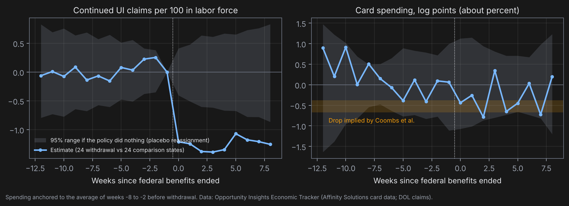
Continued unemployment claims fell by 1.25 per 100 workers in the labor force in the eight weeks after benefits ended, against a background of 4.5 claims per 100 in the withdrawal states. No permutation of treatment across states produces a drop that large. The fall is 1.34 in states that ended all programs and 0.90 in states that ended only the supplement. Part of this is mechanical: claimants on the pandemic programs stopped filing because the programs ceased to exist, so the claims series confirms the timing of the policy rather than measuring a behavioral response.
Spending: the answer depends on the comparison states
Against all 24 comparison states, card spending in the withdrawal states ran 0.31 log points (about 0.3 percent) below them over the eight weeks after benefits ended. The placebo standard deviation is 0.27, the approximate 95 percent interval runs from -0.85 to +0.17, and the probability of an estimate this large under no effect is 0.26. The estimate is stable across the usual choices: -0.37 anchoring on the single week before withdrawal, -0.67 anchoring on May 1 before any announcement, -0.41 to -0.86 weighting states by population, -0.50 in the 19 states that ended all programs, -0.58 in the June cohorts, -0.48 after partialling out each state’s COVID case rate, -0.51 in the lowest-income ZIP codes. The five states that ended only the supplement show +0.15 with a standard deviation of 1.15.
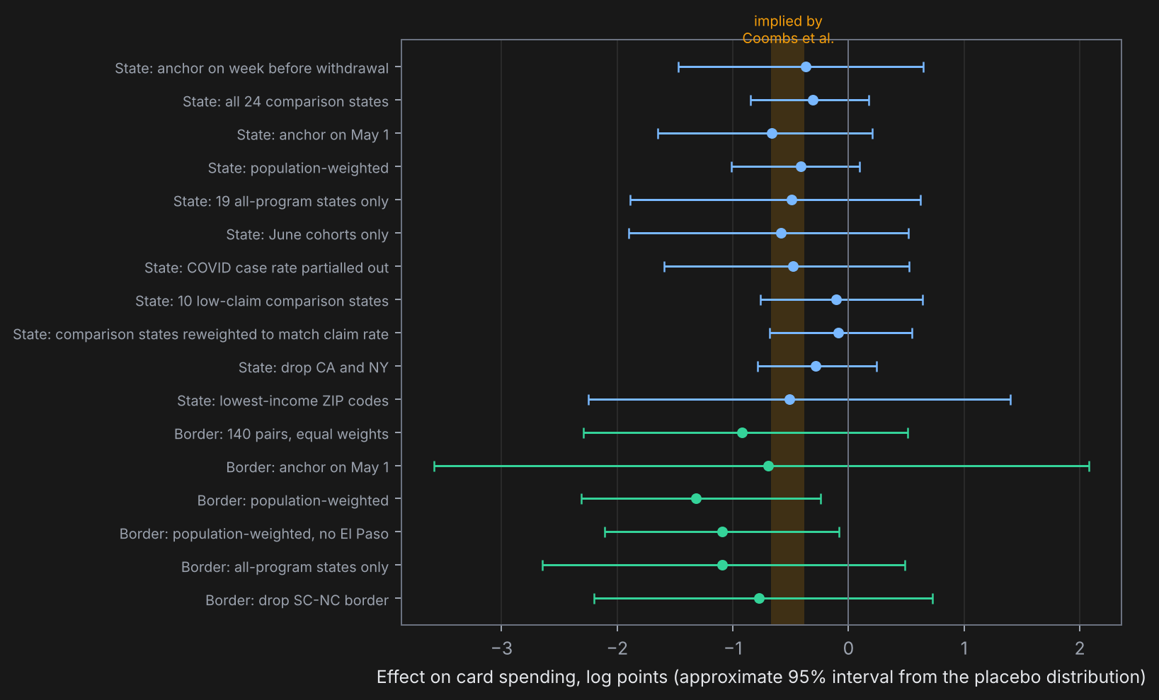
The problem is the comparison group. The states that kept benefits had twice the claim rate of the states that cut them, 9.3 against 4.5 per 100, and they include the slow reopeners: California and New York lifted most restrictions on June 15, days before the first cohort’s benefits ended. A summer catch-up in those states would produce a negative withdrawal-minus-retain gap with no help from the policy. Restricting the comparison to the ten states with claim rates under 7 per 100 moves the estimate to -0.11 (standard deviation 0.38). Reweighting all comparison states toward the withdrawal states’ claim rate gives -0.09 (0.26, with a skewed placebo distribution whose interval runs from -0.97 to +0.01). Dropping only California and New York gives -0.28. So the estimate runs from -0.1 to -0.9 depending on the comparison set, and the exposure-matched comparisons, which I would trust most, sit near zero with intervals from about -0.7 to +0.6.
A dose test within the treated states points the same way as the bank data, weakly. Regressing each withdrawal state’s own estimate on its claim rate gives a slope of -0.12 log points per claim per 100 (standard error 0.17): the more exposed half of the withdrawal states averaged -0.47 and the less exposed half -0.06. The sign is right and the precision is not there.
Pre-period checks: the anchor window makes the event weeks -8 to -2 average to zero by construction, so the informative weeks are -12 to -9 and -1. Those average +0.5 and +0.06 log points, inside the placebo band, and the pre-period slope is -0.05 log points a week, the withdrawal states drifting down slightly before treatment. Extrapolating that slope through the post period moves -0.31 to -0.07. Two series fail the check outright, spending in high-income ZIP codes and in-person spending, with pre-period gaps of 1.5 to 2.4 log points, and I do not use them, nor the employment series from the same source.
Border counties: local confounders cancel, noise does not
Adjacent counties on either side of a state line share the Delta wave, the reopening calendar and the child tax credit payments that began on July 15. I paired every county in a withdrawal state with each adjacent county in a retain state where both have card data: 140 pairs on 31 state borders, from South Carolina and North Carolina (21 pairs) to Iowa and Illinois (7). For each pair I take the withdrawal-side county’s spending minus the retain-side county’s, relative to the same pre-period average, and average across pairs. The placebo distribution reassigns treatment across states and rebuilds the pairs each time, applying the same subset rule as the specification being tested.
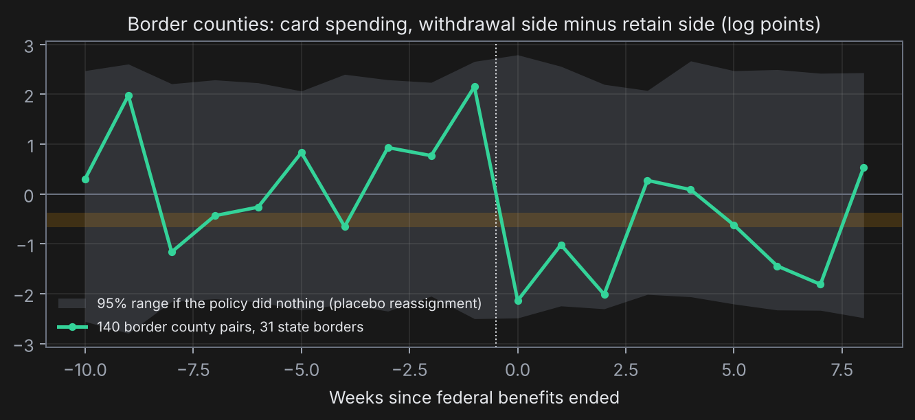
Spending on the withdrawal side fell 0.92 log points relative to the retain side (standard deviation 0.73, p = 0.20, interval -2.3 to +0.5). The median pair fell 0.82 log points and 58 percent of pairs fell. Dropping any one state border leaves the estimate between -0.7 and -1.4. Weighting pairs by population, with each pair’s weight the harmonic mean of the two counties’ populations discounted for counties that appear in several pairs, gives -1.32 (p = 0.01). That estimate survives dropping El Paso, whose summer 2021 had its own story in restrictions on cross-border shoppers (-1.10, p = 0.03), and restricting to pairs where both counties are under 500,000 people (-0.98, p = 0.10).
Two things keep me from calling this a finding. First, county card data are noisy: the per-pair estimates have a standard deviation of 5.5 log points, the pre-period path swings between -1.2 and +2.0 with a slope of +0.37 log points a week, and the week before withdrawal shows a 3 log point dip on the retain side that reverses a week later. Anchoring on that week alone would have produced a -3 log point “effect” with p = 0.02, which is why both designs anchor on a seven-week average. Second, the design should show a dose response and cannot. The only county-level exposure measure the tracker publishes is the rate of new regular claims, which misses the pandemic-program recipients who lost everything, and it covers 74 of the 140 pairs. Splitting those at the median gives +0.9 log points for the more exposed counties and -1.3 for the less exposed, each with a standard deviation around 1.5. That is a failure of the measure and the sample size as much as of the hypothesis, and it leaves the border result where the state result is: suggestive, unconfirmed.
What the data could have detected
About 3.36 million people were claiming unemployment benefits in the withdrawal states in late May 2021. At the working paper’s $145 a week, the implied loss is about $490 million a week; that applies the paper’s average to everyone, including regular claimants in the five supplement-only states who lost less, so it is an upper bound. Against the roughly $73 billion a week those states spend on the kinds of consumption that run through cards (personal consumption less housing, health care and financial services, scaled by the states’ 41 percent population share; a rough proxy, since card use varies by category and income), that is 0.67 percent. Against all consumption it is 0.38 percent. The working paper’s own $2 billion total, spread over seven weeks, implies 0.39 percent of card-type spending. Call the implied effect 0.4 to 0.7 percent.
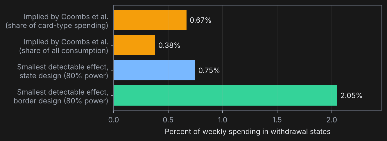
With 80 percent power the state design can detect an effect of about 0.75 to 0.8 percent and the border design about 1.5 to 2 percent. The state design is just underpowered for the implied effect; the border design is well short, because county card series are several times noisier than state series and no amount of geographic matching fixes that.
The direct way to say what the data can and cannot distinguish is to test each estimate twice, against zero and against the implied effect, using the placebo distribution for both:
| Comparison set | Estimate | Approximate 95% interval | Rejects zero? | Rejects an effect of -0.40? | Rejects -0.67? |
|---|---|---|---|---|---|
| All 24 comparison states | -0.31 | -0.85 to +0.17 | No | No | No |
| Population-weighted | -0.41 | -1.01 to +0.10 | No | No | No |
| 10 low-claim comparison states | -0.11 | -0.76 to +0.64 | No | No | No |
| Reweighted to the treated claim rate | -0.09 | -0.97 to +0.01 | No | No | No |
No comparison rejects zero and none rejects the implied effect. The reweighted comparison comes closest to ruling out the upper end: a normal approximation on its placebo standard deviation would reject -0.67 at p = 0.02, but its placebo distribution is skewed and the inverted test does not reject. The trusted comparisons lean toward the small end of the implied range and cannot rule out either end.
An earlier version of this analysis averaged the tracker’s moving average within each week, which spreads each weekly value over thirteen days, and anchored on the single week before withdrawal. It reported +0.21. Changing only the weekly aggregation to the Saturday value moves that same specification to -0.37. In weekly panels the aggregation choice is part of the design and belongs in the write-up.
What would settle it
- ZIP-level data with a real exposure measure. The effect concentrates among a few percent of households. Comparing ZIP codes by their share of pandemic-program claimants, within a state and week, would raise the signal several times over and give the dose test that both designs above lack.
- Cardholder panels. Following the same accounts through the cut, as Coombs and coauthors did, recovers the 20 percent drop directly and shows where the money stopped being spent, by merchant category and by distance from home. That is the design a payments network can run and a public dataset cannot.
- A registered prediction. Before looking at richer data, write down the number: recipients in the withdrawal states cut card spending by 15 to 25 percent in the eight weeks after benefits ended, concentrated in in-person retail and restaurants, with no change among non-recipients in the same ZIP codes. If a cardholder panel shows a drop under 10 percent, the working paper’s sample of credit-constrained Earnin users overstated the aggregate response.
Bottom line
Public card data neither confirm nor contradict Coombs and coauthors. The withdrawal states spent between 0.1 and 0.9 percent less than comparison states after the cut, with the lower figure coming from the comparisons I trust most, and every interval includes both zero and the effect the bank data imply; no test against either rejects. The effect was large for the people who lost benefits and small relative to everything else that moves state spending in a given week, and the second fact decides what public data can show. Before reading a null result in aggregate data as “no effect,” compute the smallest effect the data could have found, and before reading a negative point estimate as confirmation, check who is in the comparison group.
Quick answers
What did Coombs, Dube and coauthors find? Among low-income workers receiving benefits in 2021, early withdrawal cut benefits by $278 a week, raised employment by 4.4 percentage points and earnings by $14 a week, and cut spending by $145 a week, about 20 percent (working paper figures).
Does public card data show the drop? Not reliably. Estimates run from -0.1 to -0.9 log points depending on the comparison states, and none is distinguishable from zero.
What does the border design add? Local confounders cancel; the estimate is -0.9 to -1.3 log points with wide intervals and no usable dose test.
What would it take to see the effect? Data at the level of the people affected: ZIP codes by claimant share, or cardholder panels.
Code, data steps and the audit log that reproduce every number and chart: https://github.com/vranand1/pandemic-ui-card-data. Data: Opportunity Insights Economic Tracker (Chetty, Friedman, Stepner and the Opportunity Insights Team), with card data from Affinity Solutions and claims from the U.S. Department of Labor; county adjacency from the Census Bureau; consumption aggregates from the BEA.